I lost my first Saint in a pond, stupidly. Someone who was brave enough to wade onto murky waist-deep water looking a disc of his own found it and offered to return it (always write your phone # on the bottom of your discs!). But I had already ordered a replacement, with big plans for dyeing, so I told him to keep it.
Got the replacement, all the way from Sweden. Drew up the design:
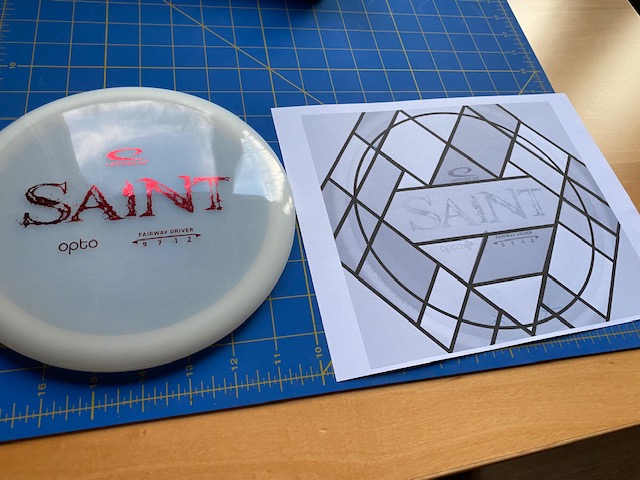
After five attempts, I got the design cut out on a piece of vinyl and transferred to the disc. Then I pulled off the parts that I wanted to dye black.
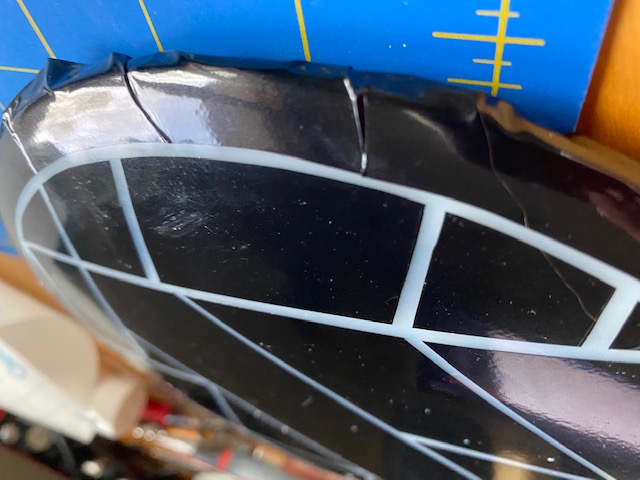
Because the vinyl is flat and the disc is curved, there were a lot of these little creases along the edge where the vinyl just wasn't stretchy enough to lay smooth. I tried my best to flatten them out. And in the end, I did a pretty good job of it. But the black dye did bleed through on a couple.
The black came out pretty weakly towards the edges, where it didn't get enough dye. Alas. And, it came out this strange bronze color, not black. Luckily, that fit the concept just fine.
So, I got out my glue-based dye mixes and started to paint.
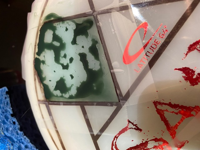
Turns out, that plastic is super hydro-phobic and the glue would just bead up and roll around. And the colors really wouldn't saturate. I didn't want to use the acetone-based mixes because acetone eats the factory stamps, and I wanted to preserve all of that - because the whole stained glass design was based around the "SAINT" logo. But, since the glue wasn't cutting it. I had no choice.
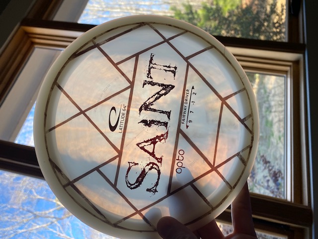
The acetone mixed dyes saturated a lot better. And the mixes I made were surprisingly gentle on the stamps. But, the Dip-N-Glo yellow that I used in the middle section absolutely tore through the logo. The red logo color instantly liquefied and slid off when the dip-n-glo hit it. I tried to clean it up as best I could, but a lot of the red smeared around between the letters. Since I was then trying to preserve the silver foil under the red so at least the "SAINT" would still be there in some form, I didn't get very aggressive in trying to get rid of the red.
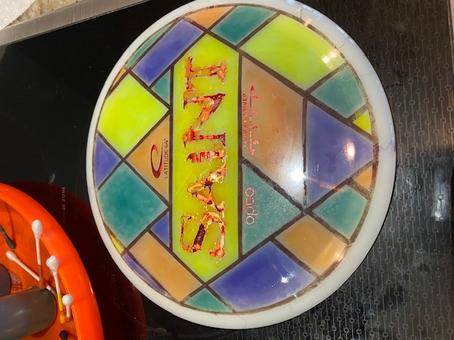
Anyway, It turned out OK. Not glorious.
![]()
I did want the colors to be a little mottled, like antique stained glass. And the bronze color works fine as leading. Wish I hadn't used that yellow in the middle, though!
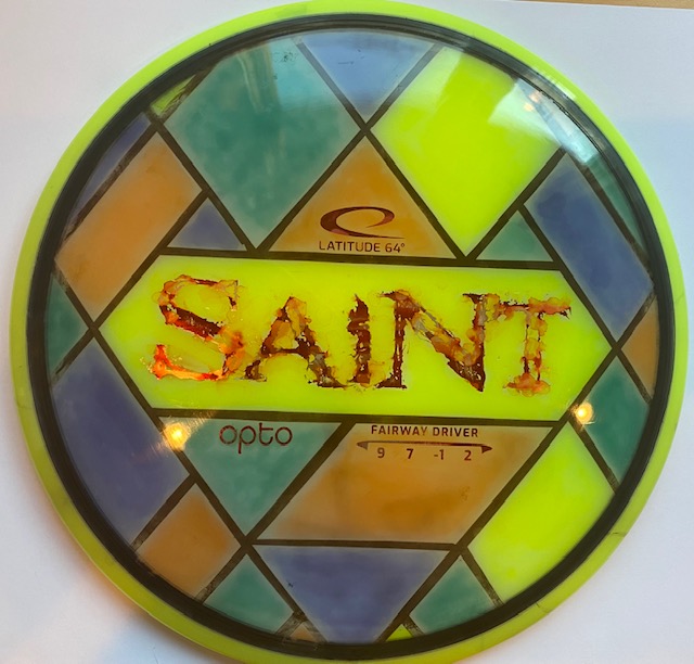
Spun a black border around the outside of the design, then added a yellow rim. Now it looks like it was originally a bright yellow disc! This should make it easier to find, especially edge-on. White discs are surprisingly hard to find in the woods. Bright (UV-reactive!) chartreuse is much easier to spot.
Think of it as antiquing. (I think it looks good. )
it looks better in sunlight, for some reason.